Data Visualization · Freelance · Academic Collaboration
Visualizations that changed how mediators understand peace processes
The PA-X peace agreements database contains over 2,000 formal peace agreements across 150+ peace processes since 1990. Policymakers, mediators, and researchers needed tools to make sense of this data in real time — not in academic papers published months later.
Visualization Engineer · University of Edinburgh / PeaceRep
Described as 'immediate and instant' by government ministers and mediators
Used by international mediators and donor states in active peace processes
Referenced in Christine Bell's PeaceTech (Palgrave Macmillan, 2024) as changing how mediators approach negotiation
Published at IEEE VIS 2025 (the highest rated venue for visualization research) · Convergence 2022
What made this hard
Peace processes are not linear. They go backwards. They restart. They take decades. But most of the frameworks policymakers use assume progress is sequential — which means they systematically misread setbacks as failures rather than as normal features of the process. The design challenge was not to simplify the data. It was to make the complexity itself visible — and trust that the people who needed to understand it would find their way in.
What I designed
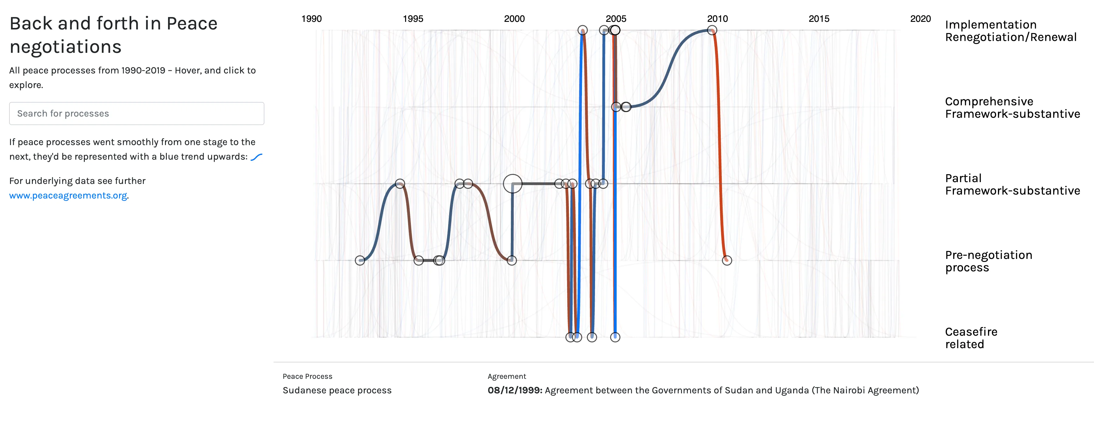
The Messy Timeline
Each peace process displayed as a curved line spanning time — from ceasefire to pre-negotiation to partial agreement to comprehensive agreement to implementation. A "perfect" peace process would move smoothly upward. None do. The visualization shows all processes at once: a tangle of lines that looks chaotic until you hover over one, which highlights it and tells its specific story. The visualization was intentionally named "messy." The mess is the point.
The impact was immediate with government ministers and high-level mediators. People who had been thinking about peace processes as linear timelines suddenly saw — visually, instantly — that every successful process they admired had gone backwards before it went forward. Christine Bell, Professor of Constitutional Law at the University of Edinburgh and lead researcher on PA-X, wrote that the visualization 'helped create a broader vista amongst international mediators, donor states and international organizations, of what a peace process is' — shifting how practitioners approach negotiation in the moment.
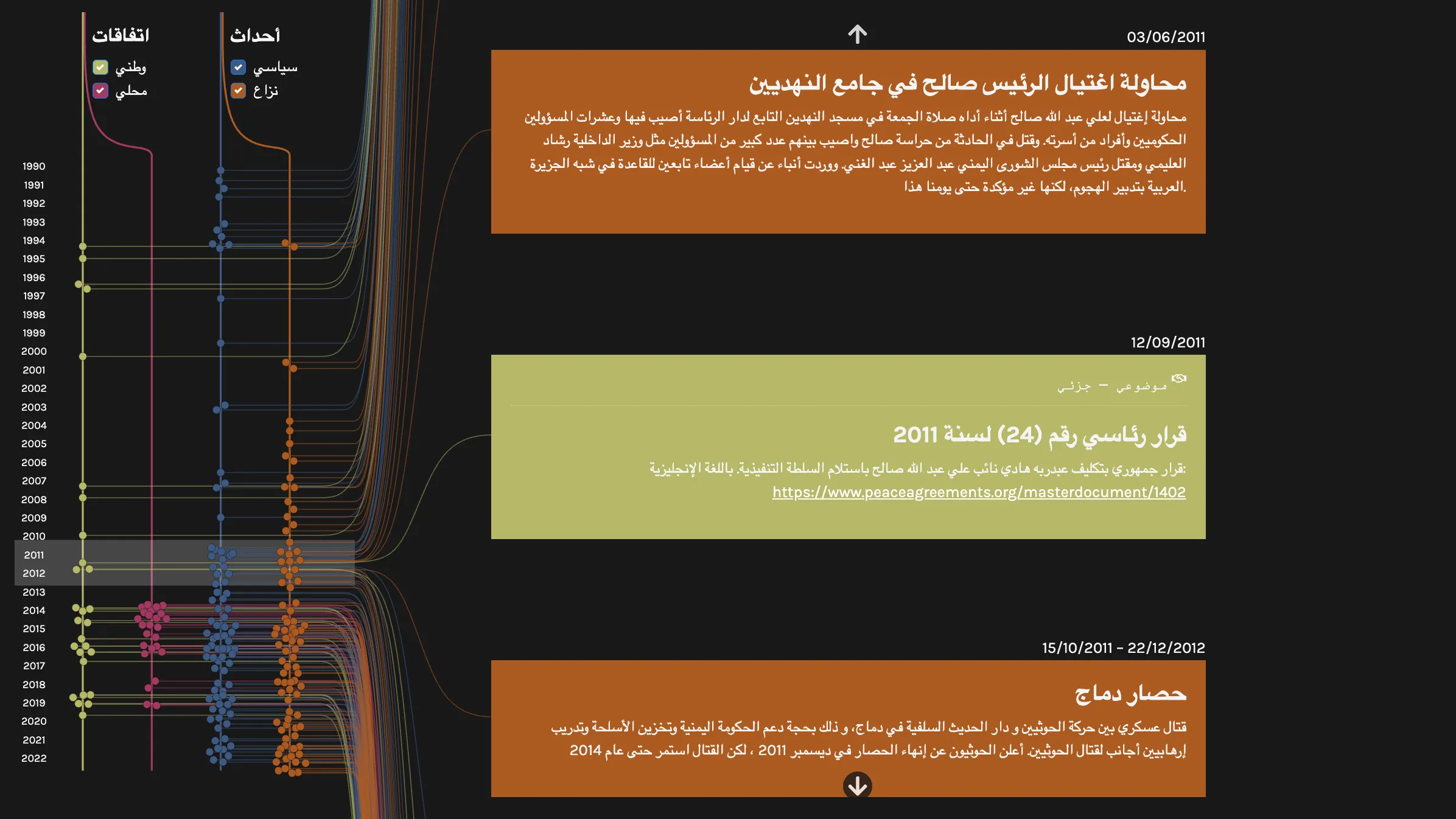
The Yemen Timeline
A scrollable bilingual (English/Arabic) timeline of peace agreements, political events, and conflict events. Designed in collaboration with Yemeni researchers, women's civil society groups, and the UN Office of the Special Envoy. The hardest design problem: Arabic reads right to left. Our initial design was conceived entirely from a western, left-to-right perspective. We had to fundamentally redesign the information flow — not just translate the text — to make the tool genuinely usable by Arabic readers.
The Matrix
A dense, intentionally complex visualization of the full PA-X coding structure — 2,000 agreements, each as a vertical line, dots indicating which topics are addressed and with what intensity. It is, deliberately, overwhelming at first glance. The point is the data itself: the sheer scale and complexity of what peace processes address, made visible as a single image.
What I took from this into product work
Three things I carry from this work into every product context:
The best visualization is not always the clearest one. Sometimes the right design reveals complexity rather than resolving it — because the user needs to understand the complexity, not be protected from it.
Co-design with domain experts is not optional when the stakes are high. At Celonis, I run the same deep-dive sessions I ran with peace researchers — sitting with the people who will actually use the tool until I understand not just their tasks, but their mental models.
Data is never neutral. Every encoding choice is an argument. I learned this working with lawyers, political scientists, and Yemeni civil society groups who could see the political implications of a color choice or a label I treated as purely aesthetic. I carry that awareness into every design I make.
Details
Live Tools
All visualizations are publicly accessible:
Publications
Bell, Bach, Kauer. "Ways of seeing: Peace process data-viz as a research practice." Convergence, 2022.
Vancisin, Wang, Henry, Schöttler, Havens, Kauer, Badanjak, Bell, Bach. "Visualizing Peace Transitions." IEEE VIS 2025, Vienna (the highest rated venue for visualization research).