PhD Research
What actually happens when visualization meets its audience — and why it matters for design
Data visualizations present numbers. People bring knowledge, memory, and personal context. Through field studies, prototypes, and live deployments at the University of Edinburgh (2018–2024) I studied that gap — and built interfaces to close it. The work spans 11 peer-reviewed publications with 150+ citations across venues including CHI, IEEE TVCG, and IEEE CG&A.
The question I started with
My PhD — Understanding Visualization Discourse and Building Discursive Visualizations (University of Edinburgh, 2024) — asked a simple question: when people encounter a data visualization outside a controlled setting, what actually happens? I studied this across three connected research questions.
What I found
I analyzed 475 real comments on the Reddit community r/dataisbeautiful using Grounded Theory — a rigorous qualitative methodology — and identified 10 distinct reaction types: observations, hypotheses, opinions, conclusions, clarifications, proposals, critiques, additional information, testimonies, and jokes.
The finding that changed how I think about design: people don't engage with data analytically first. They engage personally first. They match the data to their own experience, their own beliefs, their own spatial or social context — and then decide what to think about the numbers. The chart is almost secondary. The topic is primary.
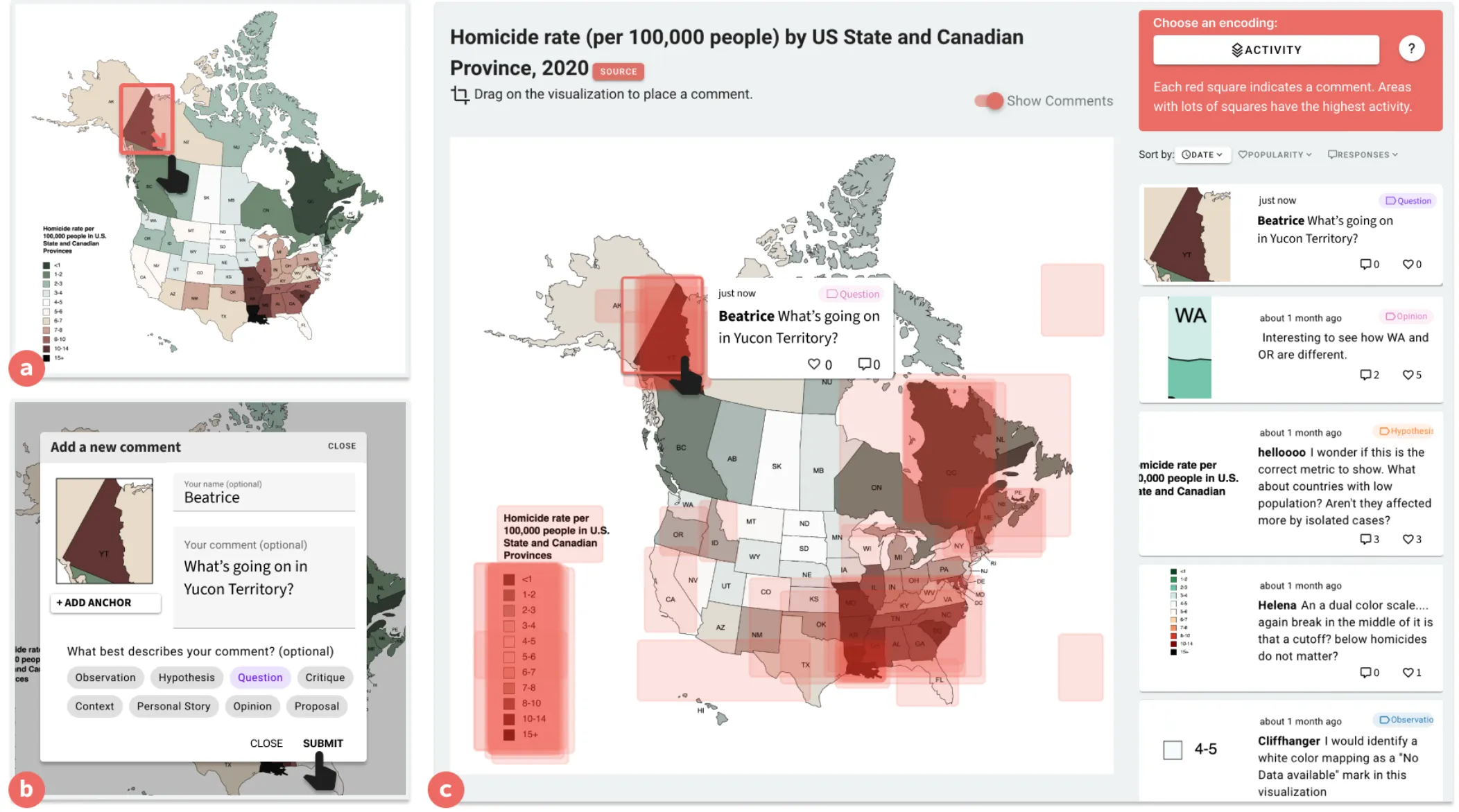
Discursive Patinas (IEEE TVCG 2025)
I built an annotation platform called Viscussion where audience comments become a visual layer on top of a data visualization, creating what I called a "discursive patina" — the way a visualization changes its appearance as people discuss it. Tested across 90 participants in 3 studies, the system showed that anchoring comments spatially within a visualization (rather than in a separate comment section) improved navigation of discussions and led to more careful, specific engagement with the underlying data.
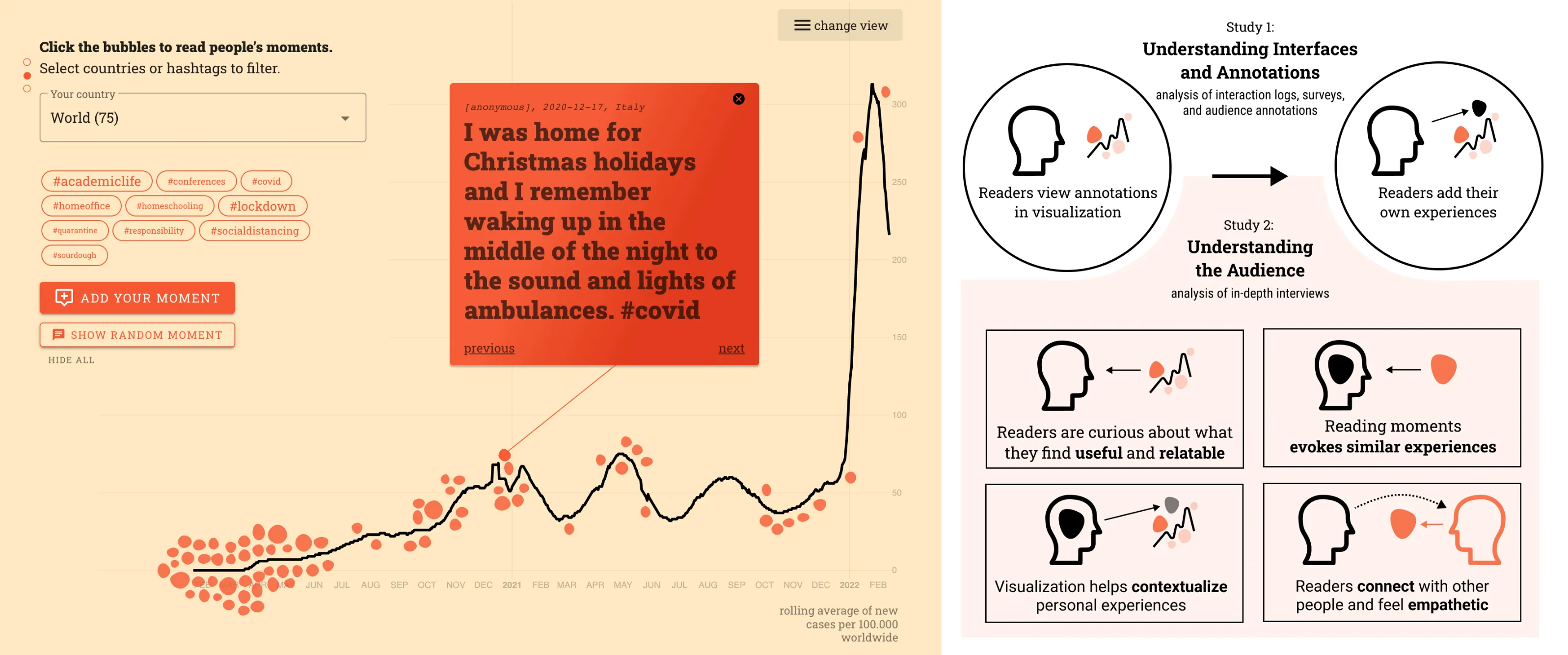
Collective Storytelling (IEEE CG&A 2025)
The CoronaMoments platform let people annotate a COVID-19 case chart with personal memories — "I remember being home for Christmas that year" placed at the corresponding point on the timeline. In a 6-month live deployment with 2,409 sessions, embedded audience annotations produced longer engagement and higher participation than separated comments. People spent more time with the visualization when other humans' stories were woven into it.
How it changed how I design
My research background is why I do product design.
Context comes before comprehension. My research showed that people don't analyze data first — they match it to their own experience, beliefs, situation. Then they decide what to think. I design for that reality, not for an idealized user who reads charts objectively.
Every encoding choice is a claim about what matters. Color, labels, what you show and what you hide. On peace process tools, lawyers taught me these choices have political weight. At Celonis, the weight is operational: a color choice in a process visualization can shift where an analyst looks first, which problems get attention, which get missed. I design knowing that.
Research is a skill, not just a background. I've run field studies, built research prototypes, published peer-reviewed papers. When I hit a design problem I can't solve by pattern-matching, I know how to design the research that will actually answer the question.
Details
Full Publication List
| Title | Venue | Year | Cit. |
|---|---|---|---|
| The Public Life of Data: Investigating Reactions to Visualizations on Reddit | CHI | 2021 | 35 |
| Discursive Patinas: Anchoring Discussions in Data Visualizations | IEEE TVCG | 2025 | 10 |
| Ways of Seeing: Peace Process Data-Viz as a Research Practice | Convergence | 2022 | 10 |
| Toward Collective Storytelling: Investigating Audience Annotations in Data Visualizations | IEEE CG&A | 2025 | 5 |
| FacelLift: A Transparent Deep Learning Framework to Beautify Urban Scenes | Royal Society Open Science | 2020 | 44 |
| Mapping and Visualizing Deep-Learning Urban Beautification | IEEE CG&A | 2018 | 28 |
| Geographic Network Visualization Techniques: A Work-In-Progress Taxonomy | Computer Graphics | 2019 | 2 |
| Participatory Deep Maps: Towards Discursive User Engagement with Data Visualizations | IEEE VIS CityVis | 2019 | 1 |
| Visualizing Peace Transitions | IEEE VIS | 2025 | — |
| Understanding Visualization Discourse and Building Discursive Visualizations (PhD thesis) | Univ. of Edinburgh | 2025 | — |