I design products that
close the gap between
humans and data.
Hi, I'm Tobias Kauer (PhD). I specialize in interfaces where data is the product — turning raw information into decisions people can act on. I approach that work as a systems thinker and recovering academic, comfortable sitting with ambiguity, and rigorous about closing the loop: measuring user behavior until I understand exactly how design impacts business metrics.
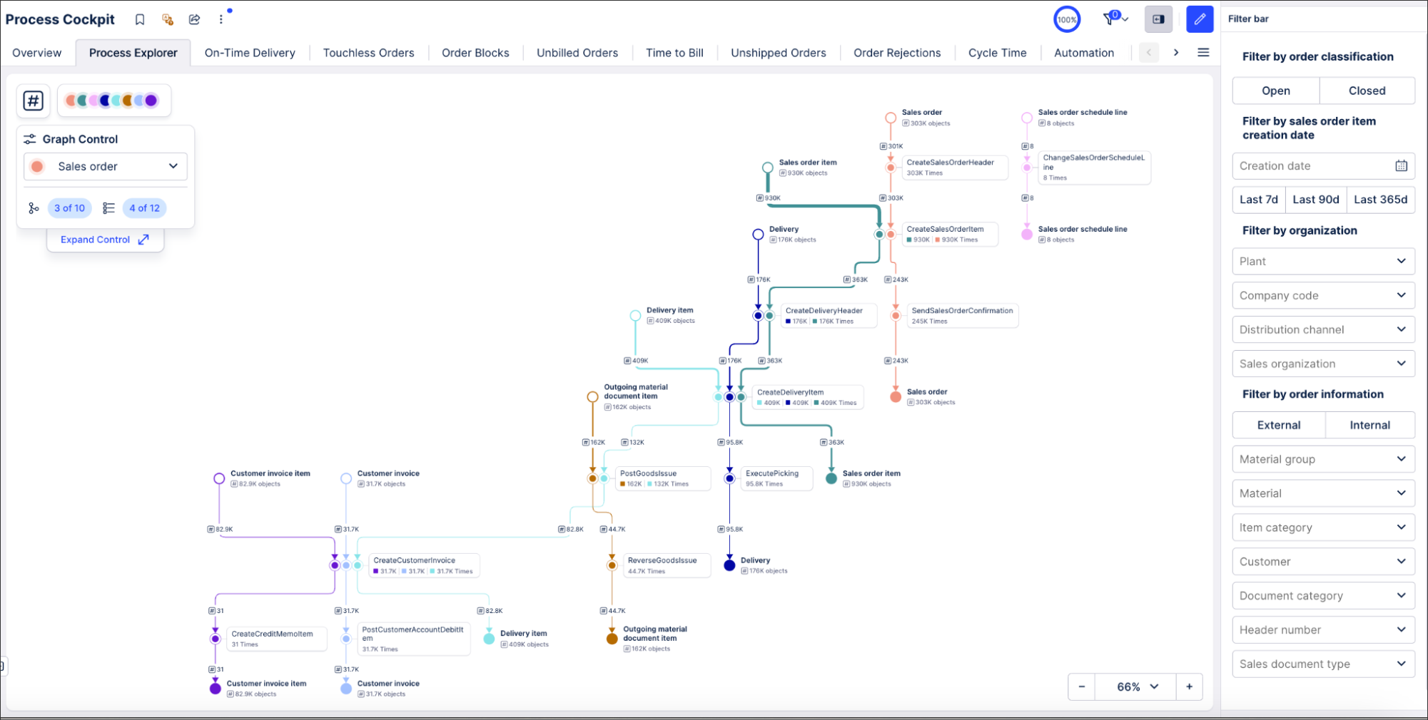
Impact
- First quantitative UX framework in the Product Experience team — design decisions now grounded in telemetry data
- Unlocked public sector market through accessible visualization design
- Interaction patterns that give users control over information density
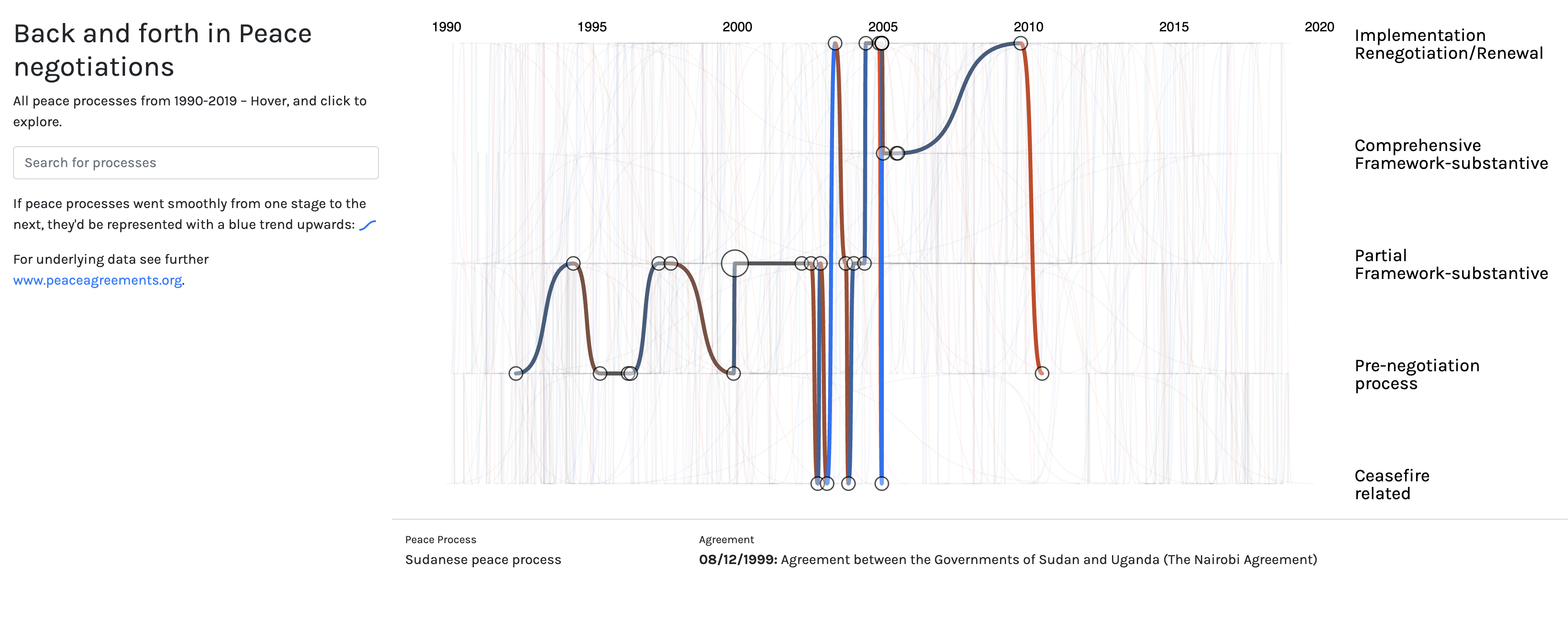
Impact
- Described as 'immediate and instant' by government ministers and mediators
- Used by international mediators in active peace processes
- Published at IEEE VIS 2025 · Convergence 2022

Impact
- 6.5× more customers acquired after platform relaunch
- Repeat rate nearly tripled — from ~9% to ~27%
- Returning customers grew from 3% to 40% of revenue
More work
1.6 billion grocery purchases, mapped
A visualization linking diabetes prevalence in London neighborhoods to nutritional diversity. The finding: food habits matter more than income. Longlisted at the Information is Beautiful Awards 2019.
View project →
Accessible data visualization for German public services
I contributed a visualization component library to KERN — an open-source design system for German federal, state, and municipal government services. The goal: go beyond WCAG compliance to make data visualization genuinely usable for everyone.
View project →The day my map went viral on Reddit
A map showing where German place names end in -ingen, -heim, -itz, -ow. The patterns trace centuries of migration and settlement. I made it for fun; 7,000 people upvoted it on r/MapPorn.
View project →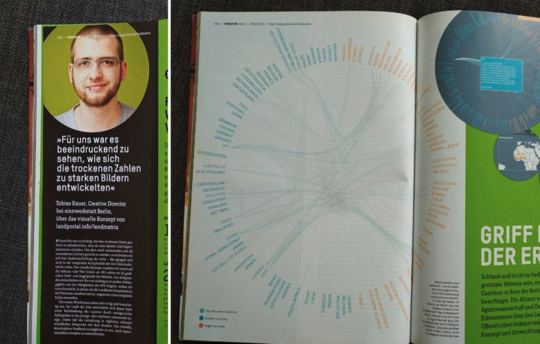
My first visualization in print
A visualization of global land deals for the Land Matrix project — featured in PAGE Magazine in 2012. The moment I realized data visualization might actually be a career.
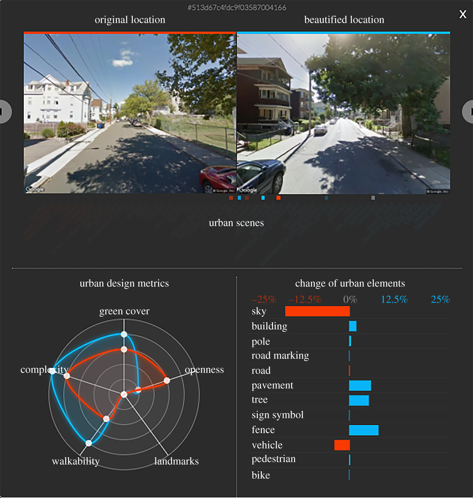
Making AI legible to urban planners
Visualization work for a deep learning framework that beautifies urban scenes and explains why. The challenge: helping architects understand algorithmic outputs without requiring them to be ML experts. Built at Nokia Bell Labs.
Read the paper →
Speaking and teaching
I speak at world-leading conferences and local meetups — CHI, IEEE VIS, Information+, Datavis Toulouse, and others. I've taught data visualization to students at NYU and the University of Edinburgh. If you'd like me to speak at your event, get in touch.
Get in touch →
Maptime Berlin organizer
Co-organized Maptime Berlin — a community meetup for people interested in maps, cartography, and geo-visualization. Sometimes you just want to talk about projections with other nerds.
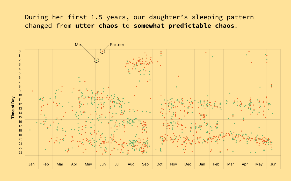
When do people talk about sleep?
I tracked my daughter's sleep for her first year — every nap, every night, every wake. What started as chaos slowly became a pattern. Watching order emerge from the noise was one of the most satisfying things I've ever visualized.
View on Reddit →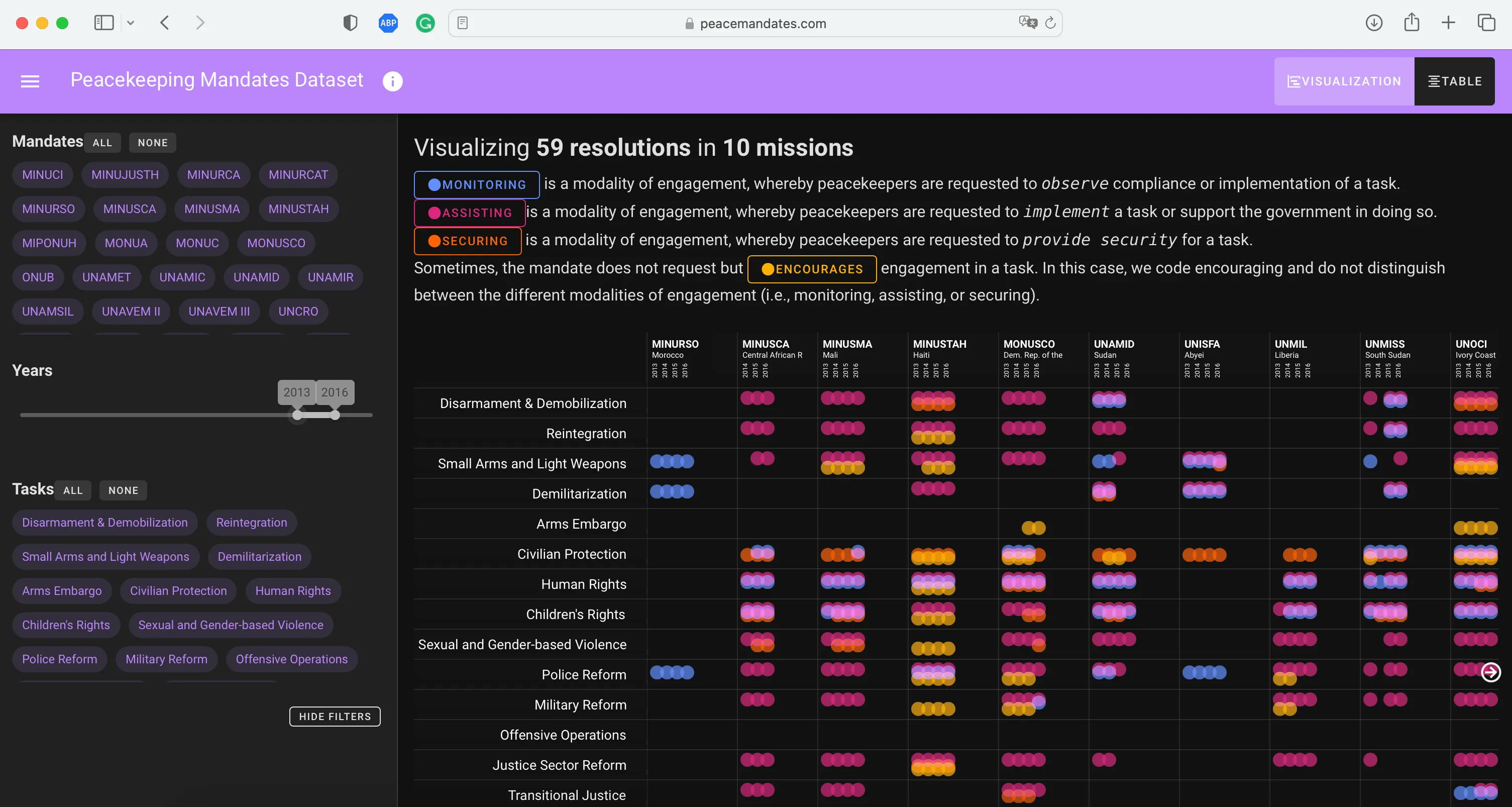
Visualizing what peace negotiators actually agreed to
Peace Mandates maps the commitments made in peace agreements — what was promised, by whom, and whether it happened. Built to make the gap between words and action visible to researchers, journalists, and civil society.
View project →How mobile phones reveal what makes a city alive
A visualization built for a study of urban vitality in six Italian cities — using mobile phone activity to test Jane Jacobs's principles of city life across space and time.
Read the paper →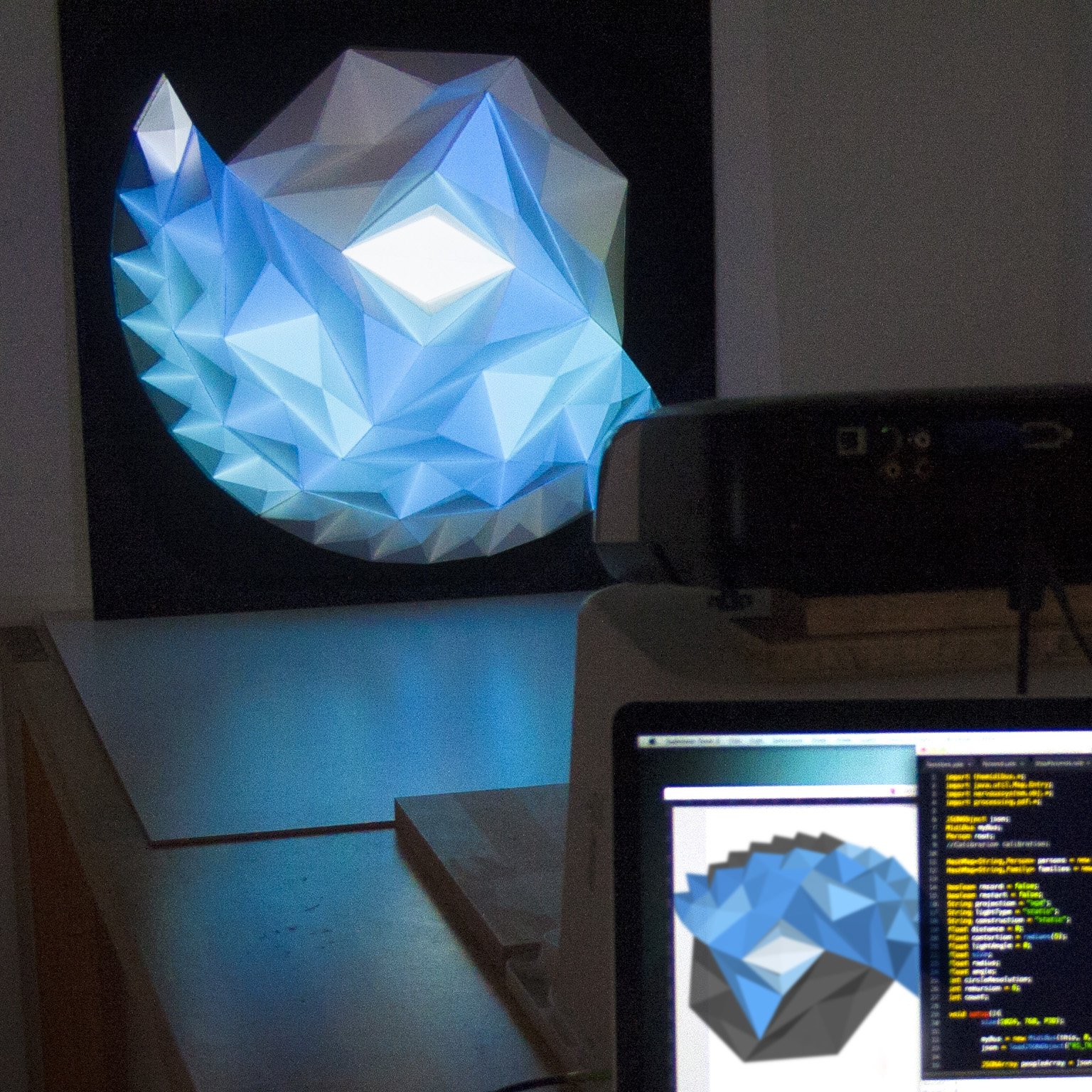
When data doesn't need a screen
I built a paper model of my grandfather's ancestry research. Data physicalization is a good reminder to slow things down — not everything needs to be interactive, and sometimes making something you can hold is how you actually understand it.