Enterprise Product Design
Bringing consistency and data-driven UX to enterprise data analytics
Celonis captures every transaction, workflow, and decision a company makes — and turns it into data that operations teams use to find where things are breaking down. The users are domain experts: data engineers, process analysts, procurement specialists at some of the world's largest companies. They know what they're looking at. My job is to help them see it better.
Product Designer · Process Mining · 2023–present
First quantitative UX framework in the Product Experience team — design decisions now grounded in telemetry data
Unlocked public sector market through accessible visualization design
Designed interaction patterns for information density control
How I work with process data
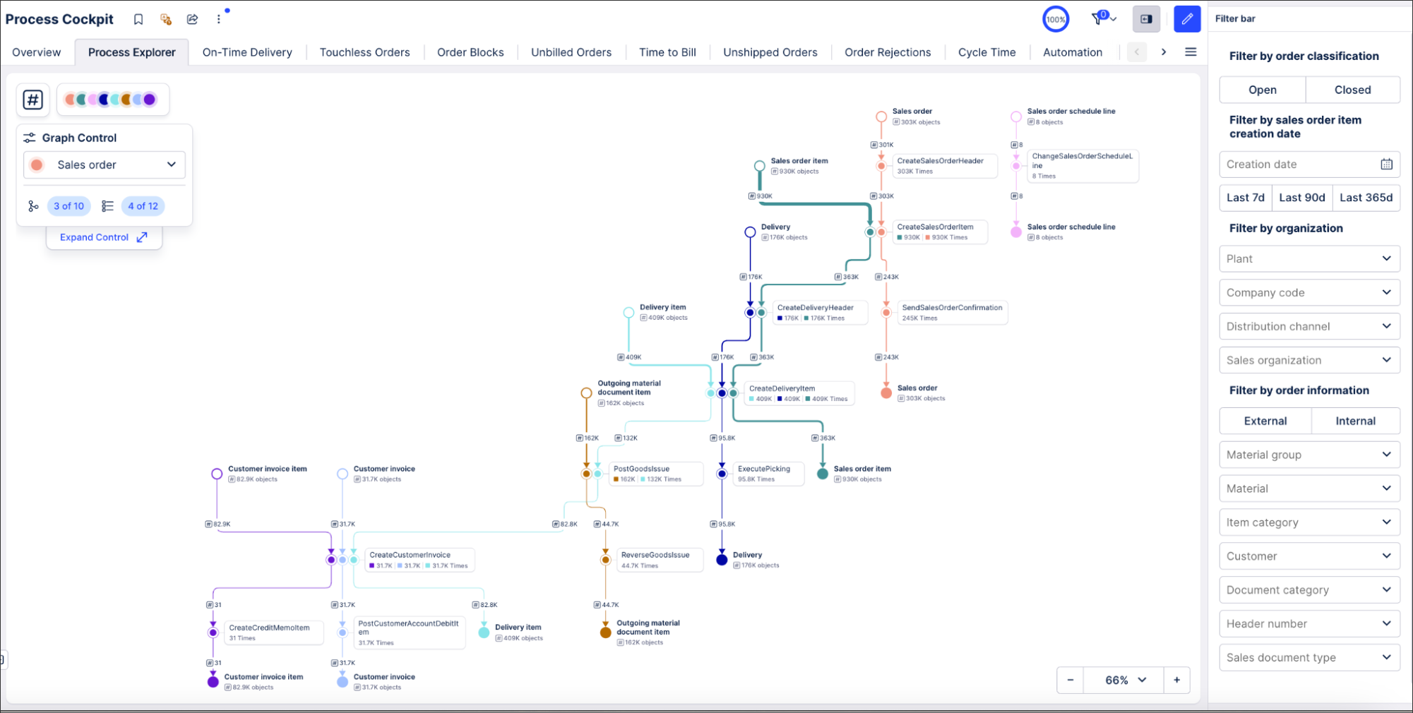
Process data is dense by nature. A single procurement process might involve hundreds of steps across dozens of systems. The challenge isn't showing all of it — it's helping users move fluidly between overview and granular detail without losing their place.
Three problems I keep returning to: how to control information density as users drill down; how to make filtering meaningful before it's applied; and how to bring consistency to a product surface that grew faster than its design patterns.
What it took to design for experts
Celonis users don't need to be told what they're looking at. A procurement specialist knows what contract leakage means. A process analyst can read process data without an explanation. What took me time to understand was the inverse: which parts of what we show them actually require design work, and which parts I could leave alone.
I work this out through proximity — deep-dive sessions with domain specialists, PMs, and engineers; auditing existing surfaces to understand what patterns users have already internalized; and constantly testing my own assumptions against what the data shows people actually do.
How I turned the product on itself
Celonis is built to help companies understand their processes through data. It took me a while to ask the obvious question: were we doing the same for our own product? I wanted to understand how our users interact with Celonis the way Celonis understands its customers — through their data.
So I built the infrastructure to do it: a framework for tracking user journeys quantitatively, measuring where people succeed, where they drop off, and what we can remove. It was the first time the Product Experience team had this kind of data. It changed how we make decisions.
Details
Making Design Measurable
Before the MUJ program, design decisions at Celonis were almost entirely qualitative. I built a quantitative UX framework — in collaboration with the Product Analytics team — that introduced structured telemetry tracking for user journeys: measuring where people succeed, where they drop off, and which interface elements never get used.
The findings were immediate: we identified high drop-off rates at specific friction points, discovered that older product surfaces had almost no meaningful tracking coverage, and were able to prove the positive impact of newly launched features with data for the first time.
I then proposed making this systematic: a multi-tier tracking taxonomy tied to component types, and a proposal to bake tracking directly into Celonis's design system so instrumentation stops being an afterthought.
Consistency at Scale
Process data involves a lot of visual encoding — colors, nodes, layouts — and Celonis had grown fast enough that each team had made their own choices. Users moving between surfaces had to relearn basic patterns. Color meant different things in different contexts.
I ran audits, mapped the inconsistencies, and built the evidence base that placed consistency on the roadmap. For color specifically, the problem had been stuck for years — it touched too many teams for anyone to want to own it. I took it end to end: defining a new color library for light and dark mode, building a consistent logic for mapping colors to process data, and shipping the UI for customization.
The same work contributed directly to the accessibility certification required for the public sector market.
Designing for Information Density
Process data asks a lot of users. A single dashboard might show dozens of KPIs across multiple process variants, each filterable by dozens of dimensions. The risk is paralysis — too much visible at once, no clear path to the answer.
I've been working on patterns that give users control over what they see based on how deep they want to go: zoom-driven details that reveal more information as users drill down, and filter previews that show the impact of a filter across all visualizations before it's applied.
Both are grounded in the same principle: the user should be able to choose their level of detail, not have it chosen for them.
Product screenshots used with permission. Detailed feature designs are not shown to respect confidentiality.